Property Business Cards for Realtors

Looking for a fun new way to advertise your listing?  

Try some property business cards!

Sized at 2" x 3.5", these cards can be easily handed out to friends and potential buyers, pinned to coffee shop message boards, and uniquely displayed at your Open House. Think of them as a mini property flyer that conveniently fits in your wallet!

Place your order today ~ Designed any way you like!
Final Size: 2" x 3.5", 14pt Cardstock, UV High Gloss Both Sides

Email me for pricing details at lauren@sterhan.com
(One low price
 includes everything from design to delivery!)

Property Business Card Example by Sterhan Graphic Design
Property Business Card Example by Sterhan Graphic Design

Rustic Wedding Programs

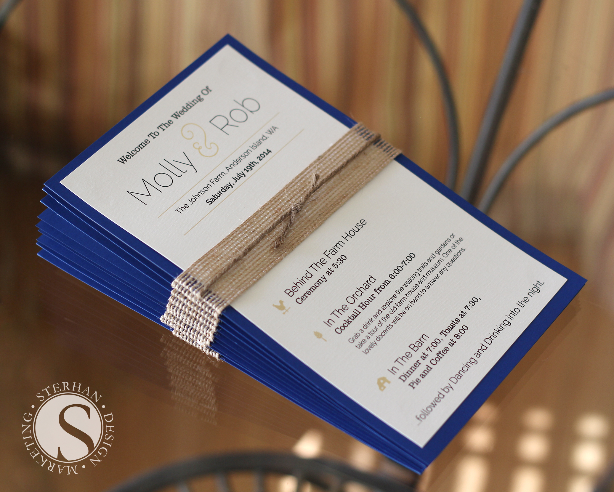
I had so much fun creating these rustic themed wedding programs for an amazing couple who just got married in Seattle Washington! Congratulations again Molly and Rob!

WeddingProgram_SterhanGraphicDesign

And the Winner Is...

Remember the amazing Graphic Design giveaway at the 3rd Annual CSMAR Realtor Expo? Prize winner Christine Ashton/Century 21 Hilltop ordered 1,000 postcards to advertise her new listing, and boy did they turn out great. Congratulations Christine! I look forward to working with you again soon!

ExopPrizeWinner

Sterhan Graphic Design Giveaway!

To all my Real Estate friends attending the 3rd Annual CSMAR Realtor Expo tomorrow in Westlake Village, be sure to purchase lots of raffle tickets!  You may be the lucky winner of an amazing Graphic Design package!  

Who doesn't like free stuff!... But a prize that may result in more listings?  Even better!   

Sterhan Graphic Design - Giveaway

Hyphen, En Dash, Em Dash.... Say What?

I was always unclear as to the proper usage of the hyphen, en dash and em dash, until I recently decided to do some research. It is very important in design to know the differences between dashes... and here is what I found:

Hyphen - The Hyphen has two main functions... to divide a word that needs to be split at the end of a line and to join a compound word.  It is also used to separate numbers in a phone number.

For example: 

  1. Editor-in-chief

  2. Use a Hyphen to di-
    vide a split word.

Also important to remember that a Hyphen is different from a minus sign. Though they look the same, a minus sign will be positioned slightly lower on the type line than the Hyphen.


EnDash - The En Dash will often be used as a substitute for the word "to".  It is used to separate dates, times, or to show durations. The En Dash also has a space on either side of it, and is approximately the width of the letter 'n'. 

For example:  

  1. April 10 – 14, 2014 

  2. 1:00 – 3:00


Em Dash - The Em Dash is used to indicate a break or interruption in thought or to separate a sentence from a bullet point. The Em Dash has no space on either side, and is approximately the width of the letter 'm'.

For example:  

Real Estate websites—a place to find your dream home.


Often times these special dash characters need to be selected from hidden text menus within design or word processing programs. But now that you understand the differences between the three, you'll be sure to select the right kind of dash for your next project.  I hope you find this information helpful!


Finding Color Inspiration From Photos

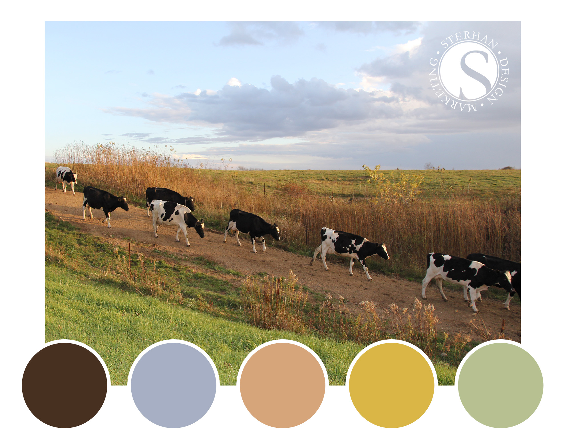
Are you thinking of designing a new logo... Maybe updating your company brand?  There are so many amazing color combinations to choose from, maybe you find yourself stuck on which direction to go? Choosing the correct colors is essential for a successful design.

Don't be overwhelmed... Try looking to photographs for some color inspiration!  

Do you have a favorite photo that you took on a family vacation, some pretty flowers that caught your eye, or maybe a stunning sunset?  Let the image spark your creativity to unlock a new color pallet!  If you have Adobe Photoshop, simply open your image, select the eyedropper tool, and click around different areas of your image to find a color combination that is one of a kind!

Of course, if you need any assistance choosing the right color combination for your next design project, I'd be happy to help.  Send me an email today! :)


Color Inspiration

"The whole world, as we experience it visually, comes to us through the mystic realm of color." 

Hans Hofmann

The Benefits of a Folded Business Card

When attending a networking event, open house, or industry party, business cards are an essential part of your branding. But you need your business card to stand out from the rest, and be something unique, especially when your potential clients are getting them by the handful.

foldingbc

Fold-Over business cards are relatively unusual and because of this, they instantly demand attention. Most business cards are flat, so when you add a fold, your card immediately stands out from the rest. Here’s why folded business cards can be so effective, and the perfect marketing tool for you.

#1  Eye-Catching - People love the interesting and unusual, so when they see something new, they tend to hold on to it. When you simply add a fold, you’ve increased the likelihood that your business card will be kept. If you make sure that your design is eye-catching, you encourage recipients to show the card to their friends too!

#2: More Space -  When you add a fold to a business card, you’ve basically doubled the space you have and how much information you can include.

#3: Added Value - Think of fun things to include on your cards now that you have more space. Create a coupon, discount, calendar, conversion chart, or ruler on one of the panels, and instantly offer value and a reason for people to hang onto your card.

Ready to order some folded business cards?  Send me an email, I'd be happy to help!